Magazine Analysis
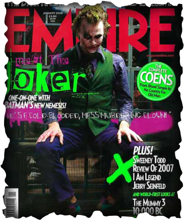
The joker
I think this is really effective due to the dark background and having the light shining down on the joker. The dark background has connotations that this character is an evil character and the light shining down shows hes being held in jail also you can see the bars behind him. The use of the bright green text is good as it stand out clearly and bright green also always assassinated as toxic chemicals or something infected. The Purple strip reminds me of an urban city graffiti as there are drips on the paint going down. This represents that its a modern film and that they may be based in an urban like city with a lot of graffiti and wrecked places. Empire is in red as you want the title of the magazine to stand out the most as the company wants to be remembered furthermore the red has connotations of blood, death and danger. Suggesting that this movie could be horror or thriller. This magazine has very good, and easy to read font which is important to the front cover as you want your audience to be able to read the big main stories in the magazine. This is like advertisement as you are trying to persuade the audience to buy your magazine. The image of the character has taken up most of the page, this is due to the new release of the movie and it states that they have a big story inside about the movie or character this also helps grab the audience attention because they are trying to apply to fan of the new bat man movie.
Rebecca White
Rebecca White
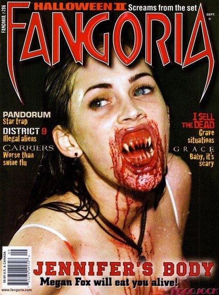
To the group this is a prime example of a bad horror magazine. Personally we think that it is unrealistic and that they haven’t used their editing tools on the computer to the best of their ability, for example on the right eye they have tried to fade it out but failed as it just looks like a small bubble also it is quite obvious that the blood is not real as it is fading and to thin. Finally we think that the magazine has nothing going for it and is not exciting at all. With the text they have tried to range it but instead made it look unprofessional. As a group we think it is the best idea not to go down this root and choose this type of magazine for our own.
Kirsty Collier
Kirsty Collier
Scream Returns:
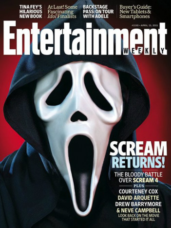
The image on this magazine cover takes the hole page up, this to grab their audience's attention so that it is the first thing to look at and also to show the image is involved in a lot of the movie that is written about in the magazine. The font used is all in simple format this is so that it is easy to read but still doesn't loose the audience's attention, the font is mostly in bold to also make it stand out. The words are in cream, white and blue, the only word in light blue is 'returns' this is to draw the audience attention to this word so they are aware it is making a comeback. The magazine title 'Entertainment' is in white this is to contrast with the image and background which exaggerate the darkness.The colours used on the magazine are red, black and white. The background is all red, it is all one colour so that it doesn't take attention away from image. They have used these colours also because black and red are associated with death and evil. under the title 'scream returns' has famous actors from scream films, having this title and also famous actors attracts audience of scream movies and also ones who know famous actors, this makes more people read and buy this magazine.
We liked this magazine cover and thought it was very effective because it is very simple looking but also attracts the audience attention, it doesn't give to much away and uses a good selection of colours. We also liked this magazine because it uses simple but effective things to attract and get their target audience. There are also faults with this magazine cover that we did not like, we did not like how simple it was because it can be effective but sometimes also can not be and can be seen as boring which loose audience interest. We also didn't like the fact there was only one photo which means the audience look at it too much and begin to get bored of the way the cover looks.
Maisie Mackenzie.
World War Z
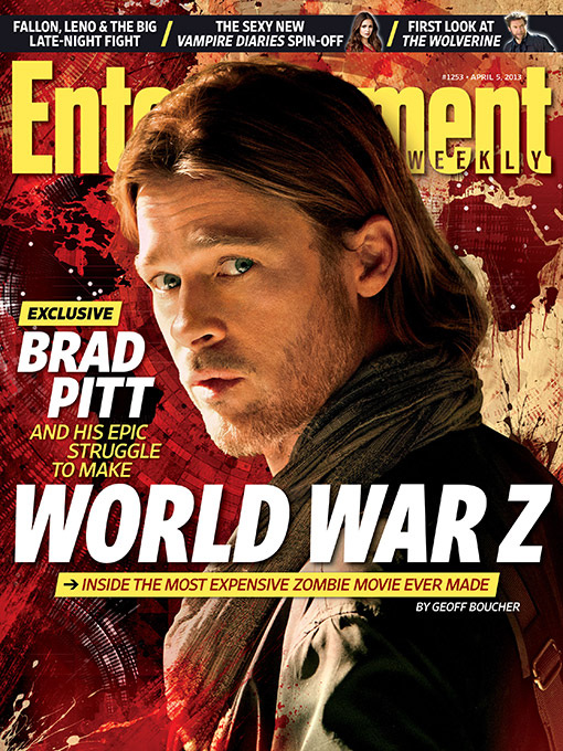
We thought that this was an effective film magazine cover because of the isolated shot of Brad Pitt contrasting to the red back ground. On this front cover we can see Brad Pitt on his own looking over his shoulder. It makes it seem like he is looking out for the danger and that he can anticipate it coming. The title which is one of the most important things is big and bold, it stands out clearly so that the audience knows the name. With a good magazine cover and a clear title when the audience see the name 'World War Z' they will want to watch the film. The background of countries around the world covered in red is effective because its shows that the plot of the film is something to do with a spread of something over the world, linking in well with the title. The red is an indication of danger, and the bottom left corner has splashing blood which again portraying future events.
Sam Collier
Sam Collier
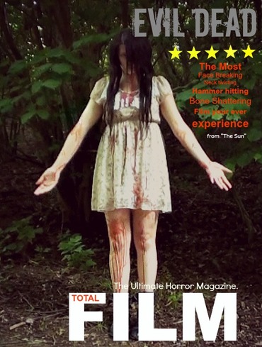
Our Practice Magazine Front cover
We Copied Total Film Logo as we thought it would be easier as this is only a practice and the get used to the programmes. We edited this on a website called pic monkey. This is get as it gives you access to loads of effect, backgrounds, overlays and text fonts. We liked the idea of the star rating which we also took the idea of from total film. However the placing of the picture was our idea as we thought the whole of the girl need to be in the picture as it adds to the horror effect because of the blood down her legs. Other Magazines such as Entertainment and Empire uses very close up shots or mid shots of the person.
Rebecca White
Empire Magazine Research
The British film magazine Empire, is posted monthly by Bauer consumer media. Empires first magazine was published in 1989. Barry Mcllheney was the editor and it was published by Emap. In early 2008 Emap consumer media was brought by Bauer. It is Britain's biggest selling film magazine, and also is available for purchase in USA, Australia, Turkey, Russia and Portugal. Empire magazine has a circulation of 160,067 (Jan-Jul 2013), and has a readership of 873,000 (Jul-Dec 2012). Empire magazine has a readership ratio of 77% being male and 23% being female. With Empire magazine there is a correlation that as the age category of the reader increases, the percentage of readers decreases. The age range of 15-24 makes up 34.8% of the readers, 25-34 is 26.7%, 35-44 is 21.4%, 45-54 is 12.5%, 55-64 is 3.6% and 65+ is 1.1%. So it appears that the older generation are less interested in reading about films.
Sam Collier
Sam Collier
Planning
We loved the hunched over image and we though it would be a great idea for a horror magazine or even a poster. We had an idea to have her hand out in front of her and add some blood which would link into the horror theme. BY added the book either in her hand or in the back ground would then relate to our film/trailer (666)
|
This was an unusual magazine cover as it has the banner in the middle but behind the actor, we loved this idea. The gold was a good colour as it says at the bottom about a celebration therefore it link in with being a winner and successful .
|
