|
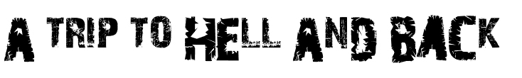
This may be effective for a tagline however,
|
|
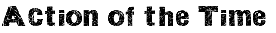
We liked the distorted effect the font gives however, on our background it didn't work as it stands out too much because of our background being slightly distorted too. |
|
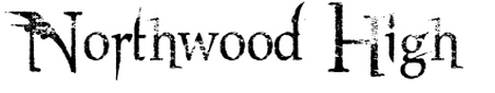
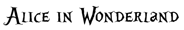
We found that this font is effective as we liked the flicks that came off the sides and how it reminds us of an old school horror writing.
|
|
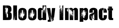
We liked this font because of the effect of it that makes it look like blood splatter. This would go with our trailer because we have a lot of blood however, we had a problem with it standing out too much. |
|
We liked the flicks in this font but we found that it looked too clean to be in a horror. |
Rebecca, Sam, Maisie and Kirsty
